
Create Radar Charts with Python and matplotlib
· 5 min readRadar charts1 can be a great way to visually compare sets of numbers, particularly when those numbers represent the features of a real-world person or object.
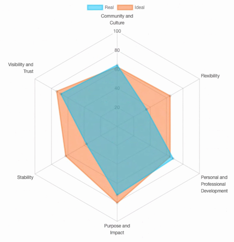
Fig. 1 - An example radar chart comparing a person’s ‘real’ workplace experience with their ‘ideal’. At Aspire, we generate these charts as part of our ‘Aspire Quotient’ workplace satisfaction survey. Made with the chart.js library.
For example, let’s say we have a database of people along with information about their proficiency in certain skills, with each skill scored within the range 0 to 100 (‘0: not at all’ to ‘100: very’ proficient). Let’s grab a couple people at random and list their skill scores (ignoring any labels for now):
[80, 24, 47, 56, 39, 34]  # person A's skill scores
[76, 1, 4, 77, 77, 56]    # person B's skill scores
In mathematical lingo, unlabeled lists like this are called “feature vectors.” Feature vectors are used to represent objects numerically for processing by pattern recognition and machine learning algorithms (but that’s material for a different post…).
We can make a comparison between the two individuals by studying these lists, but the similarities or differences would be easier to spot with a graphical representation. Let’s use a radar chart for that graphical representation!2
When each series is plotted on a radar chart, it forms a polygon representing the “shape” of that particular feature vector. After we plot two such shapes, the similarities, differences, and overall overlap become readily visible.
Coding it Up
In Python, we can generate these charts using the matplotlib package, which has built-in support for “polar” graphs. We’ll also use the pandas package to help us manipulate our data.
Install the python packages with pip:
pip install pandas matplotlib
By default, matplotlib also depends on _tkinter, which cannot be installed through pip. On Ubuntu, this can be installed with apt:
sudo apt-get install python3-tk
If for some reason you are unable to install python3-tk, you can work around this requirement by changing the matplotlib back-end at the top of your program. I have done this in order to use matplotlib on Heroku, for instance:
matplotlib.use('Agg')
Let’s begin! Follow along with this code by opening a Python shell (type python on the command line).
We’ll start with some data. Here are the same skills scores from before, only now they are represented as dictionaries with labels included.
user_a_skills = {
  'Skill A': 80,
  'Skill B': 24,
  'Skill C': 47,
  'Skill D': 56,
  'Skill E': 39,
  'Skill F': 34,
}

user_b_skills = {
  'Skill A': 76,
  'Skill B': 1,
  'Skill C': 4,
  'Skill D': 77,
  'Skill E': 77,
  'Skill F': 56,
}
We can begin working with this data by importing it into pandas as a data frame. This isn’t strictly necessary, but it will let us manipulate it more freely:
import pandas as pd

df = pd.DataFrame([user_a_skills, user_b_skills])
For example, we can easily retrieve the names of all the skills and count them. We’ll store the skills in a list called skills. Later, we’ll plot each skill as an axis of the chart:
skills = list(df)
num_skills = len(skills)
Unfortunately, matplotlib does not automatically generate angles for the axes of the chart, so we’ll have to do that manually.
from math import pi

angles = [i / float(num_skills) * 2 * pi for i in range(num_skills)]
angles += angles[:1]  # repeat the first value to close the circle
Bear in mind that zero degrees (0°) is located on the right side of the circle by default, and we’ll move counter-clockwise around the circle as the angle increases. If you are not happy with the placement of the axes, you will need to tweak the above formula to change the default offset.
Now we can begin drawing the plot. We’ll import plt from matplotlib and start by drawing the x and y axes and tick marks that make up the background of the chart. Notice that before drawing the plot, we also create subplots for each data series. This should always be done before drawing, or else you may get unexpected results:
import matplotlib.pyplot as plt

GRAY = '#999999'

# Clear the plot to start with a blank canvas.
plt.clf()

# Create subplots for each data series
series_1 = plt.subplot(1, 1, 1, polar=True)
series_2 = plt.subplot(1, 1, 1, polar=True)

# Draw one x-axis per variable and add labels
plt.xticks(angles, skills, color=GRAY, size=8)

# Draw the y-axis labels. To keep the graph uncluttered,
# include lines and labels at only a few values.
plt.yticks(
  [20, 40, 60, 80],
  ['20', '40', '60', '80'],
  color=GRAY,
  size=7
)

# Constrain y axis to range 0-100
plt.ylim(0,100)
Next, we’ll retrieve our data from the data frame. First, it might be helpful to preview the contents of our data frame:
>>> df
   Skill A  Skill B  Skill C  Skill D  Skill E  Skill F
0       80       24       47       56       39       34
1       76        1        4       77       77       56
Notice how pandas was able to digest the two dictionaries and now renders them together like a spreadsheet. This is a really nifty feature for crunching numbers, since you often need to move back and forth from Python data structures to spreadsheets. In this particular situation, using pandas is probably overkill, but it’s worth trying out!
Let’s now retrieve the data from our dataframe as lists that are ready to plot:
series_1_values = df.loc[0] \
                    .values \
                    .flatten() \
                    .tolist()
series_1_values += series_1_values[:1]  # duplicate first element to close the circle

series_2_values = df.loc[1] \
                    .values \
                    .flatten() \
                    .tolist()
series_2_values += series_2_values[:1]   # duplicate first element to close the circle
All we’ve done is retrieve each list of skill scores without labels, just like before:
[24, 80, 47, 56, 39, 34]  # person A's skill scores
[1, 76, 4, 77, 77, 56]    # person B's skill scores
So now we can plot the data!
# Set up colors
ORANGE = '#FD7120'
BLUE = '#00BFFF'

# Plot the first series
series_1.set_rlabel_position(0)
series_1.plot(
  angles,
  series_1_values,
  color=ORANGE,
  linestyle='solid',
  linewidth=1,
)
series_1.fill(
  angles,
  series_1_values,
  color=ORANGE,
  alpha=0.6
)


# Plot the second series
series_2.set_rlabel_position(0)
series_2.plot(
  angles,
  series_2_values,
  color=BLUE,
  linestyle='solid',
  linewidth=1
)
series_2.fill(
  angles,
  series_2_values,
  color=BLUE,
  alpha=0.6
)
This code is pretty self-explanatory: for each series, we feed the angles and values lists into the plot() and fill() methods of our subplots. This draws the shapes. Each shape has a solid outline and semi-transparent fill color set by the alpha argument, so that overlapping areas remain visible. I plotted the orange shape first and then blue on top because, trust me, it looks better than the other way ‘round.
And finally, we can save the image and view our creation. PNG is the default format.
# Save the image
plt.savefig('radar_chart.png')
And here is the final result!
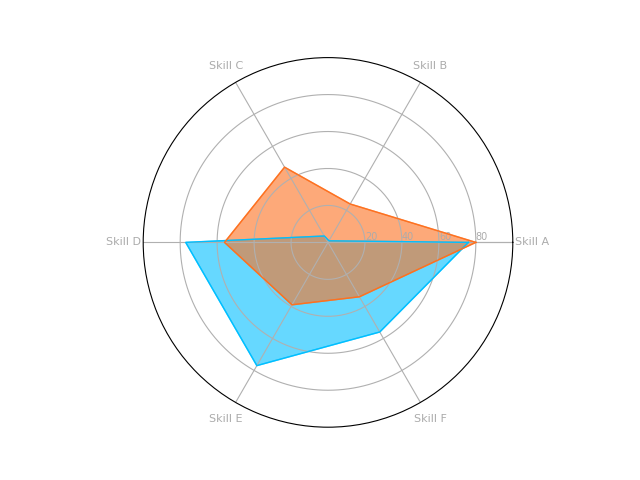
So what can we see? I see almost immediately that these two people have somewhat complementary skills. Person A (in orange) has some proficiency in everything, but is strongest in Skills B and C. Meanwhile Person B (in blue) is definitely stronger in Skills D, E, and F. Both individuals are approximately equally as strong in skill A. Pretty cool!
-
Radar charts are also sometimes referred to as ‘kite’ charts, ‘polar’ charts, or ‘spider’ charts… All fine choices, although for some reason I really dislike the term ‘spider’ chart. ↩
-
workshape.io is a great example of using radar charts to compare people’s skills, not only with other people, but also the skill requirements for job openings. ↩